Chip
Anatomy
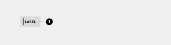
- Label
Usage Guidelines
This component may be used as an interactive control as part of a form, or as a simple link to another page or section.
Specifications
Properties
| Property | Type | Description | Required | Default |
|---|---|---|---|---|
| text | string | Inner text used as the label. | Yes | - |
Styling
Modifiers
| Name | Class | Description |
|---|---|---|
| Selected | .tux-c-chip--selected | Alternate styling used to indicate if the chip is in an active state, when used as an interactive control. |
Colors
| Name | Application | Custom Property | Roles | Default Opacity | Description |
|---|---|---|---|---|---|
| bg-color | background | --tux-comp-chip--bg-color | on-background | 0.1 | - |
| text-color | text | --tux-comp-chip--text-color | on-background | - | - |
| hover--bg-color | background | --tux-comp-chip--hover--bg-color | on-background | 0.2 | - |
| hover--text-color | text | --tux-comp-chip--hover--text-color | on-background | - | - |
| selected--bg-color | background | --tux-comp-chip--selected--bg-color | primary | - | - |
| selected--text-color | text | --tux-comp-chip--selected--text-color | on-primary | - | - |
Custom Properties
| Name | Default | Resets | Description |
|---|---|---|---|
--tux-comp-chip--bg-color | rgba(136, 136, 136, 0.2) | Yes | - |
--tux-comp-chip--text-color | inherit | Yes | - |
--tux-comp-chip--hover--bg-color | rgba(136, 136, 136, 0.3) | Yes | - |
--tux-comp-chip--hover--text-color | var(--tux-c-chip--text-color, inherit) | Yes | - |
--tux-comp-chip--selected--bg-color | var(--tux-theme--text-color, black) | Yes | - |
--tux-comp-chip--selected--text-color | var(--tux-theme--bg-color, white) | Yes | - |
Changelog
1.18.0
- chip added
Related
Contained In
Other components that use this component (not including freeform content slots).
Examples
Default
{{ include( 'components/chip.twig', {
	text: "Label"
} ) }}Selected
{{ include( 'components/chip.twig', {
	text: "Label"
	class: "tux-c-chip--selected"
} ) }}List
<div class="tux-c-chip-list">
	{{ include('components/chip.twig', {
		text: 'Music',
	} ) }}
	{{ include('components/chip.twig', {
		text: 'Movies',
		class: 'tux-c-chip--selected'
	} ) }}
	{{ include('components/chip.twig', {
		text: 'Photos',
	} ) }}
	{{ include('components/chip.twig', {
		text: 'Books',
	} ) }}
</div>